
Kroc Center Grand Reopening
BRANDING + PRODUCT INTEGRATION
May 2020–October 2020

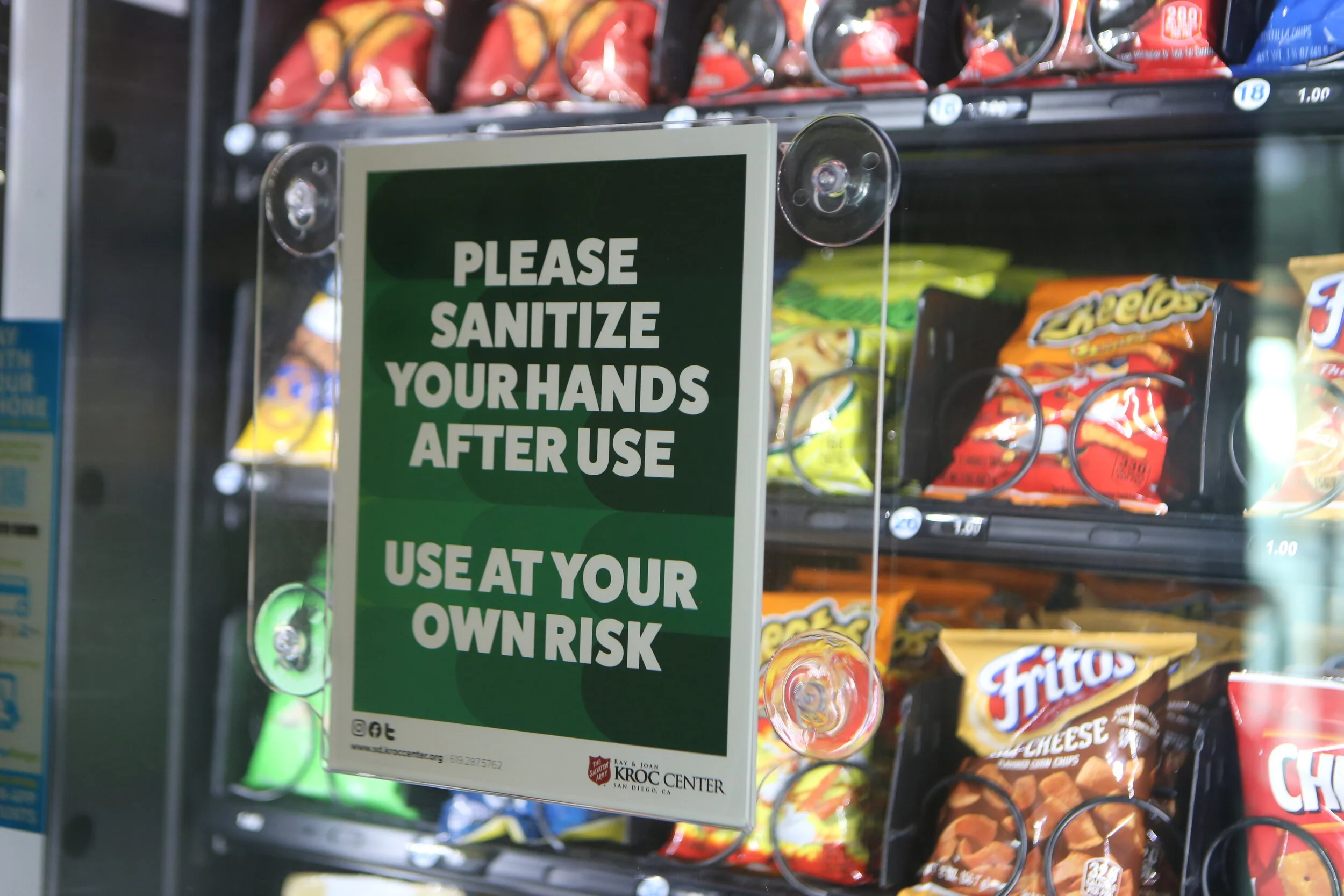
Emphasizing Safety in Design During a Pandemic.
What was done:
Brand strategy
Visual imagery
Product design
Digital strategy
Photography
Social media presence
Challenge + Solution
After the closure due to the COVID-19 pandemic, The Salvation Army Kroc Center of San Diego needed a fun and lighthearted rebrand to welcome back current members and attract potential new members, all while following safety guidelines.
A design that emphasized fun and safety was executed while also keeping in mind the company’s branding standards, such as color palette, typefaces, and tone.
The overall design was implemented in a variety of different ways—including outdoor banners, posters, buttons, stickers, web images, social media, and printed production.
Color Palette
The company’s bubbly and bright color palette was followed consistently throughout the design.
Typeface
Headlines: FatFrank heavy.
Subheadlines: Proxima Nova light, semibold, bold, and extrabold.
Body text: Proxima Nova light and regular.

Finding the Balance Between Safety and Happiness.


Art Direction, Designer, and Photographer: Yliana Alba
Marketing Director: Glynis Eckert
Social Media Content Creator: Belinda Mendoza