El Pollo Loco
BRANDING + IDENTITY WORK
July 2024–Current
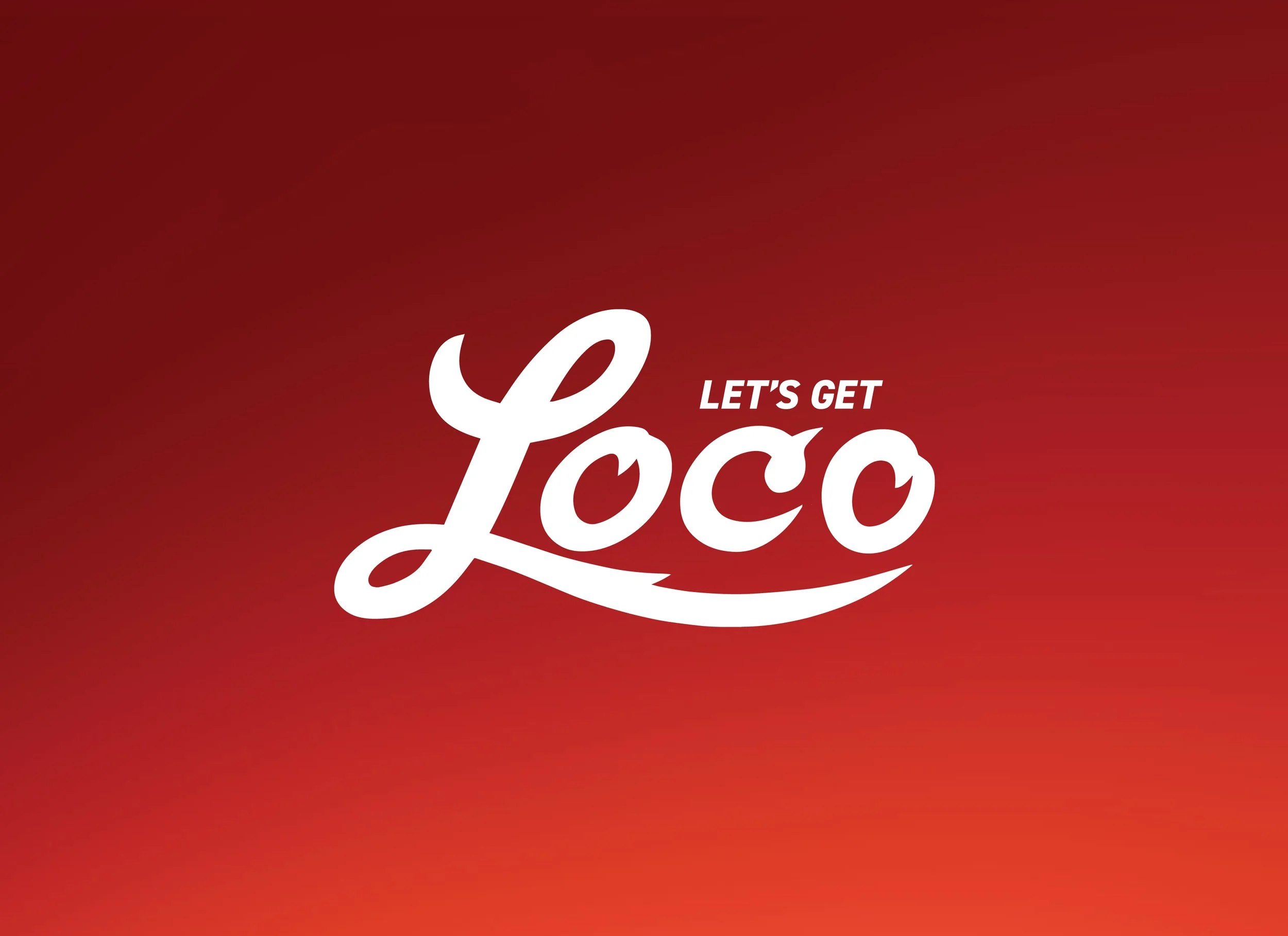
Let’s Get Loco.
What was done:
Brand strategy
Concept and execution
Visual evolution through re-brand
Print and Out of Home creative
Digital and Email creative
Photography
Social and paid media
Copywriting

Challenge + Solution
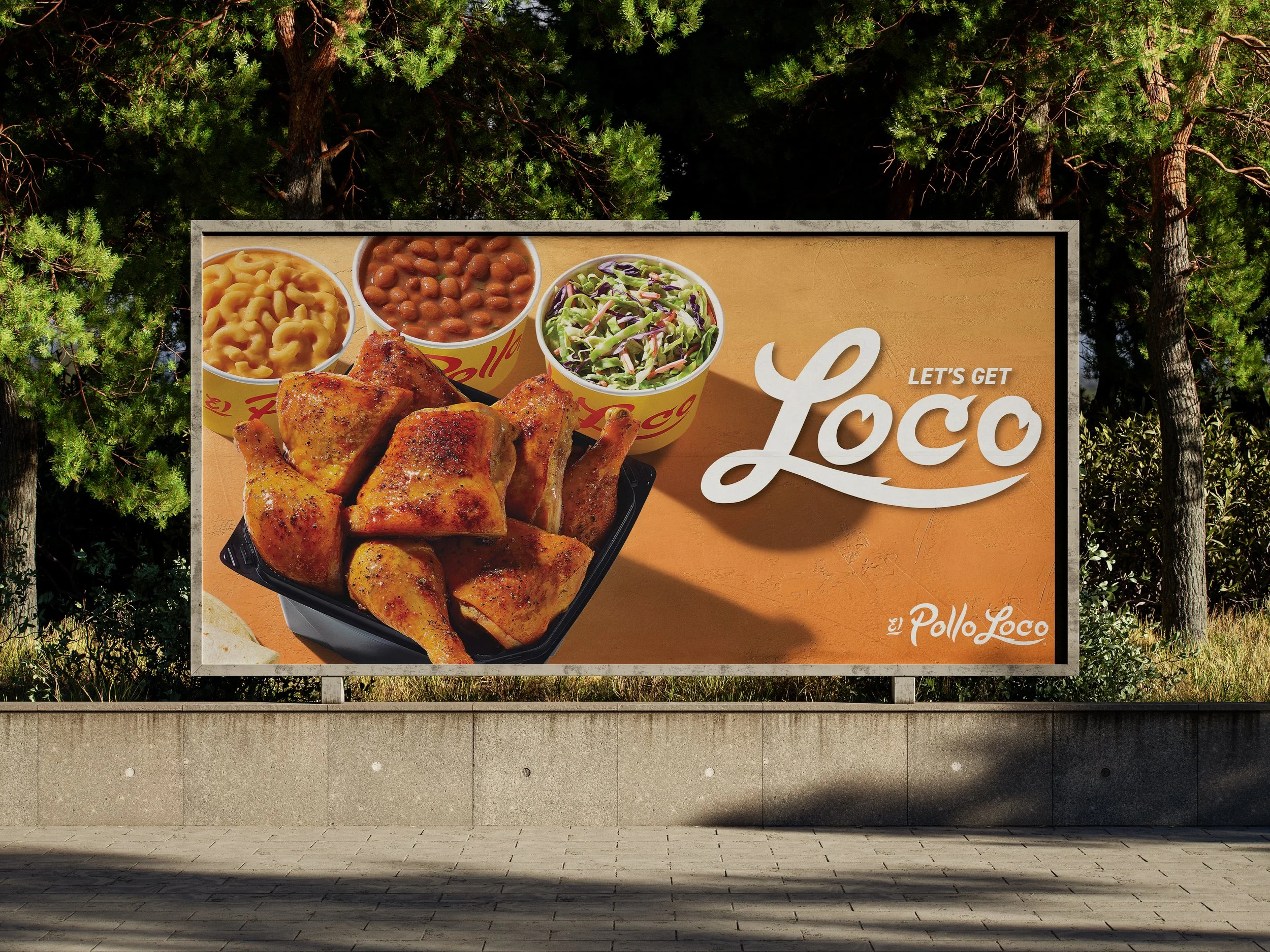
Assist in the re-brand of the beloved fire-grilled chicken brand El Pollo Loco, including updating external and internal assets to have the new typefaces, new color palette, new photography style, and new background textures.
The purpose of updating the brand look-feel was to focus more on passion and, of course, good food. The brand’s mantra is that Loco means Passion, not crazy. This new branding is seen executed through digital and printed menus, large-scale Out of Home materials, digital and social media assets, and localized marketing materials.
Color Palette.
El Pollo Loco Red is the primary brand color. This color is paired thoughtfully with Yellow, Brown, White, and Black. Depending on the product launch, Blue, Green, and Orange are introduced to invoke a sense of “new.”
Typeface
Headlines and Subheadlines: Loco Script, Barlow Extrabold, and Barlow Bold.
Body text: Epilogue Medium and Epilogue Regular.

Loco Means Anything but Crazy.

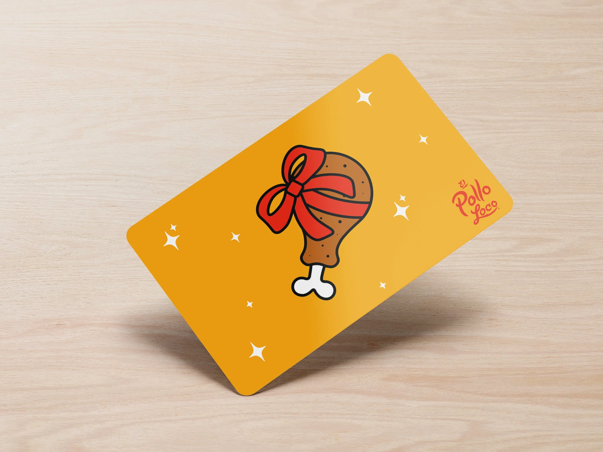

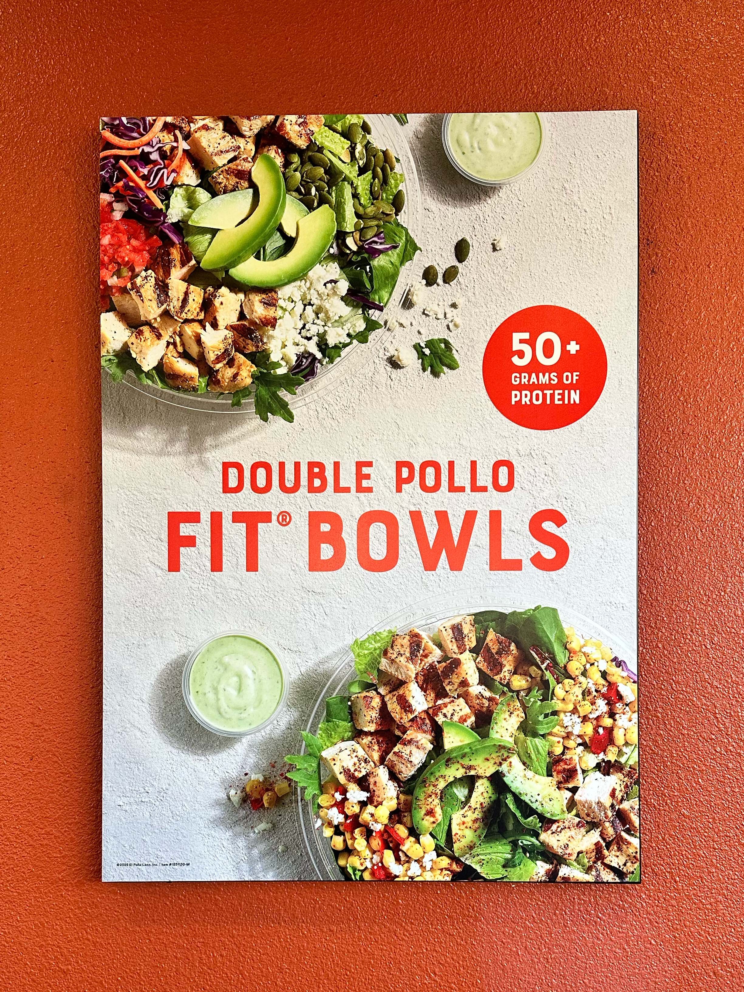

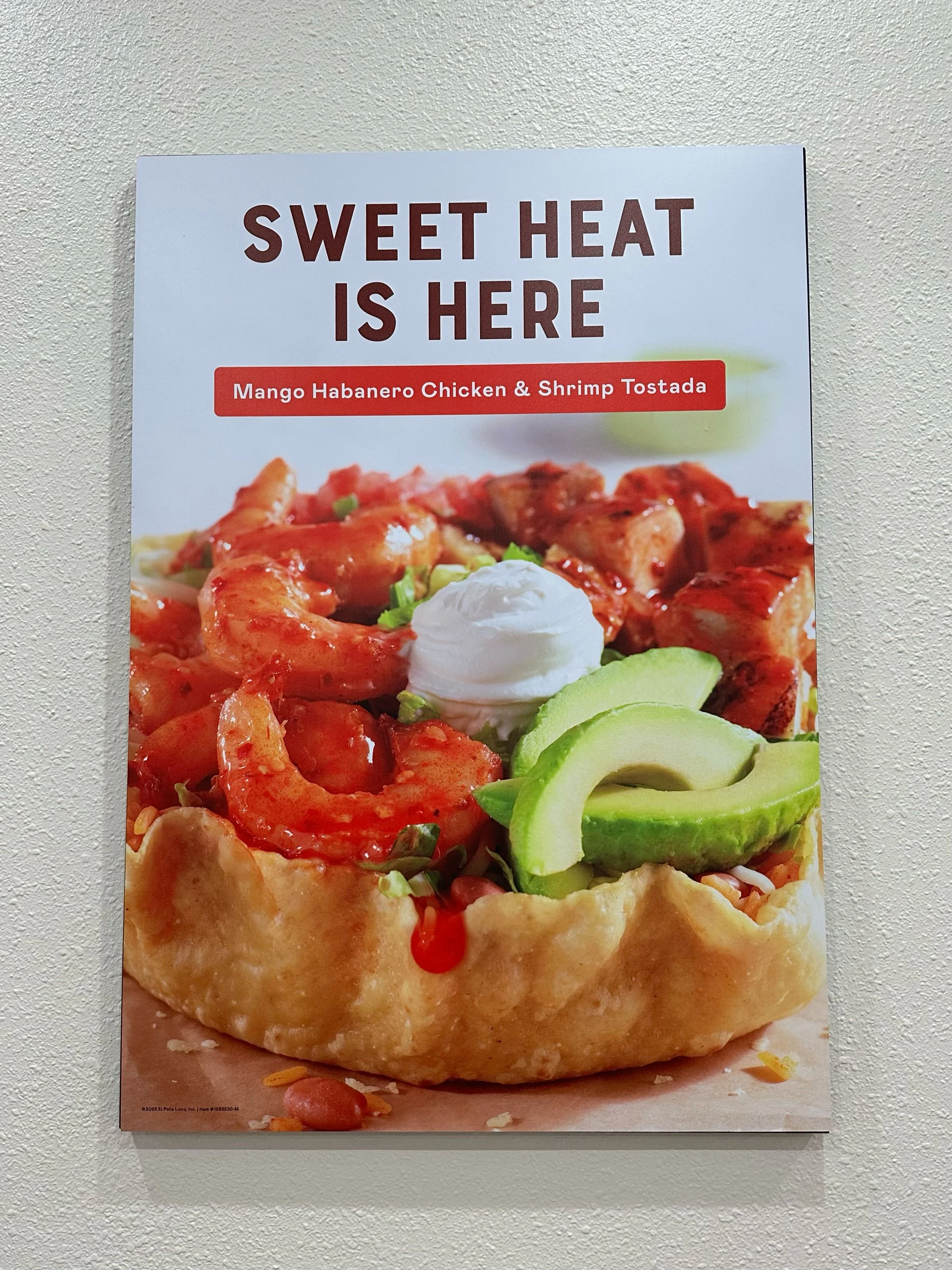
Printed Assets
El Pollo Loco creates freshly-made, Mexican-inspired chicken products crafted with innovative flavors. The brand wanted to emphasize how many products are made in-house, including the signature marinated chicken. Because anything else would be crazy.

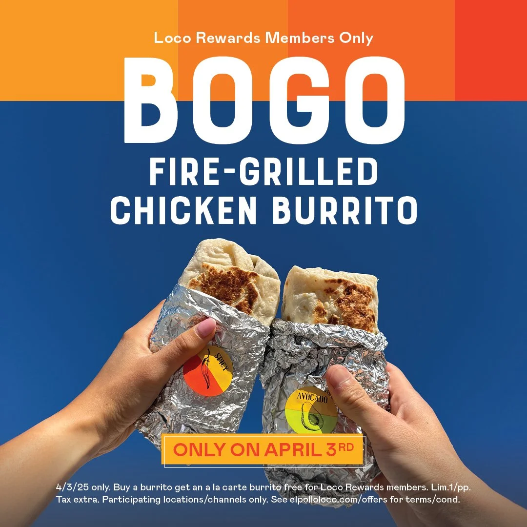


Paid Media and Organic Social
As El Pollo Loco’s design shifted through print media, it was also important that the brand maintained that look-feel for our online presence.


