QDOBA Mexican Eats
BRANDING + IDENTITY WORK
October 2021–July 2024

Making the World a More Flavorful Place Through Exciting Design.
What was done:
Brand strategy
Concept and execution
Visual evolution
Print and Out of Home creative
Digital and Email creative
Photography
Social and paid media
Copywriting
Challenge + Solution
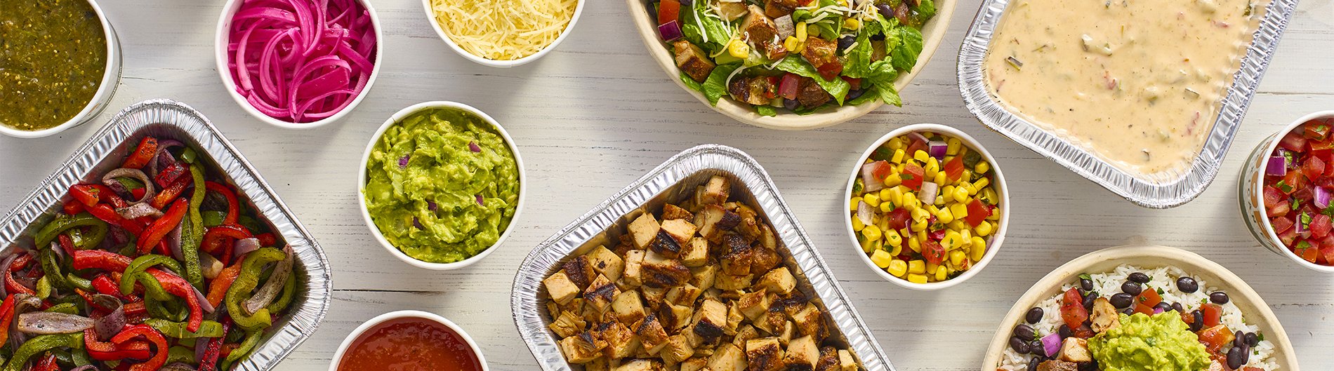
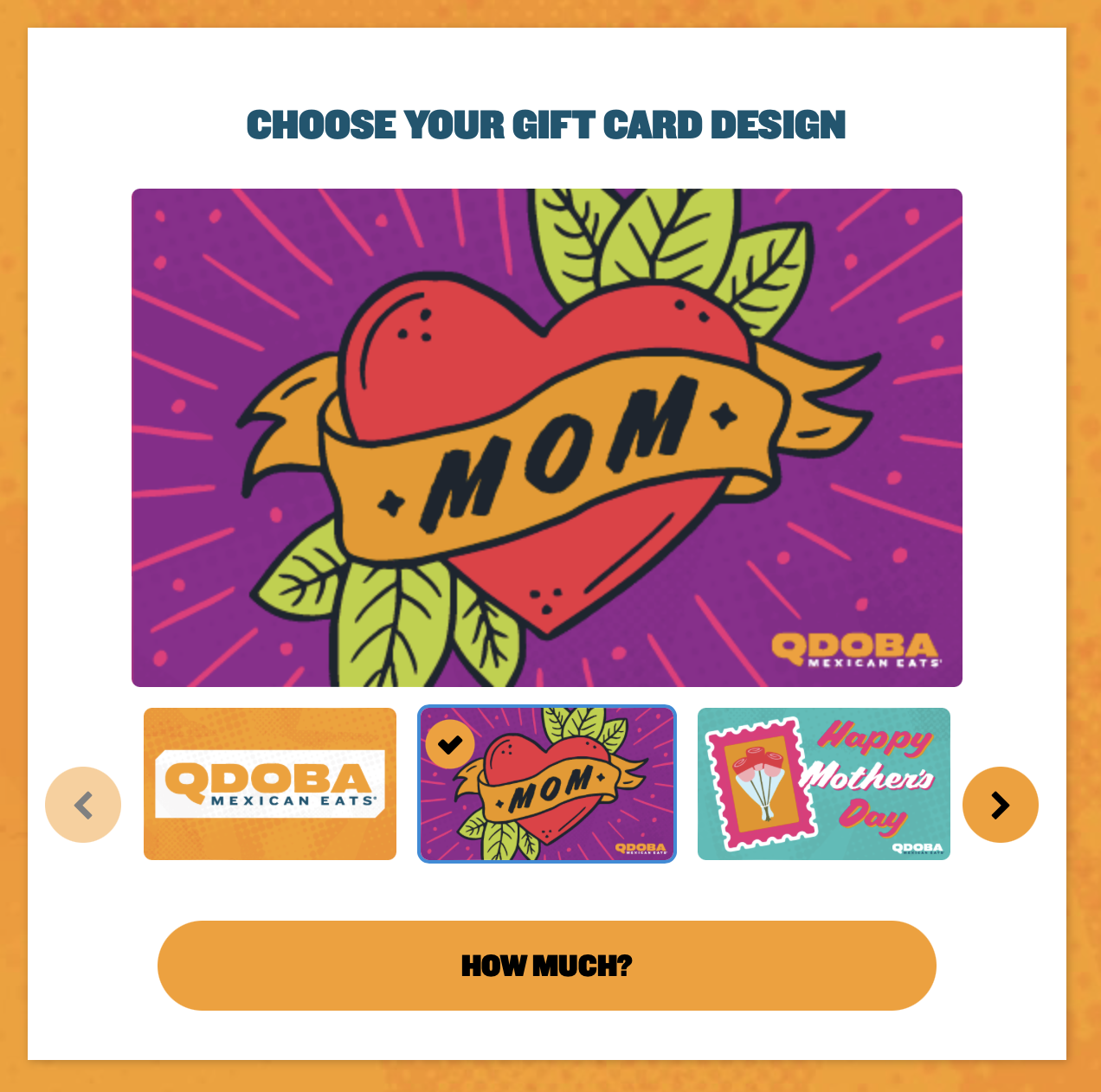
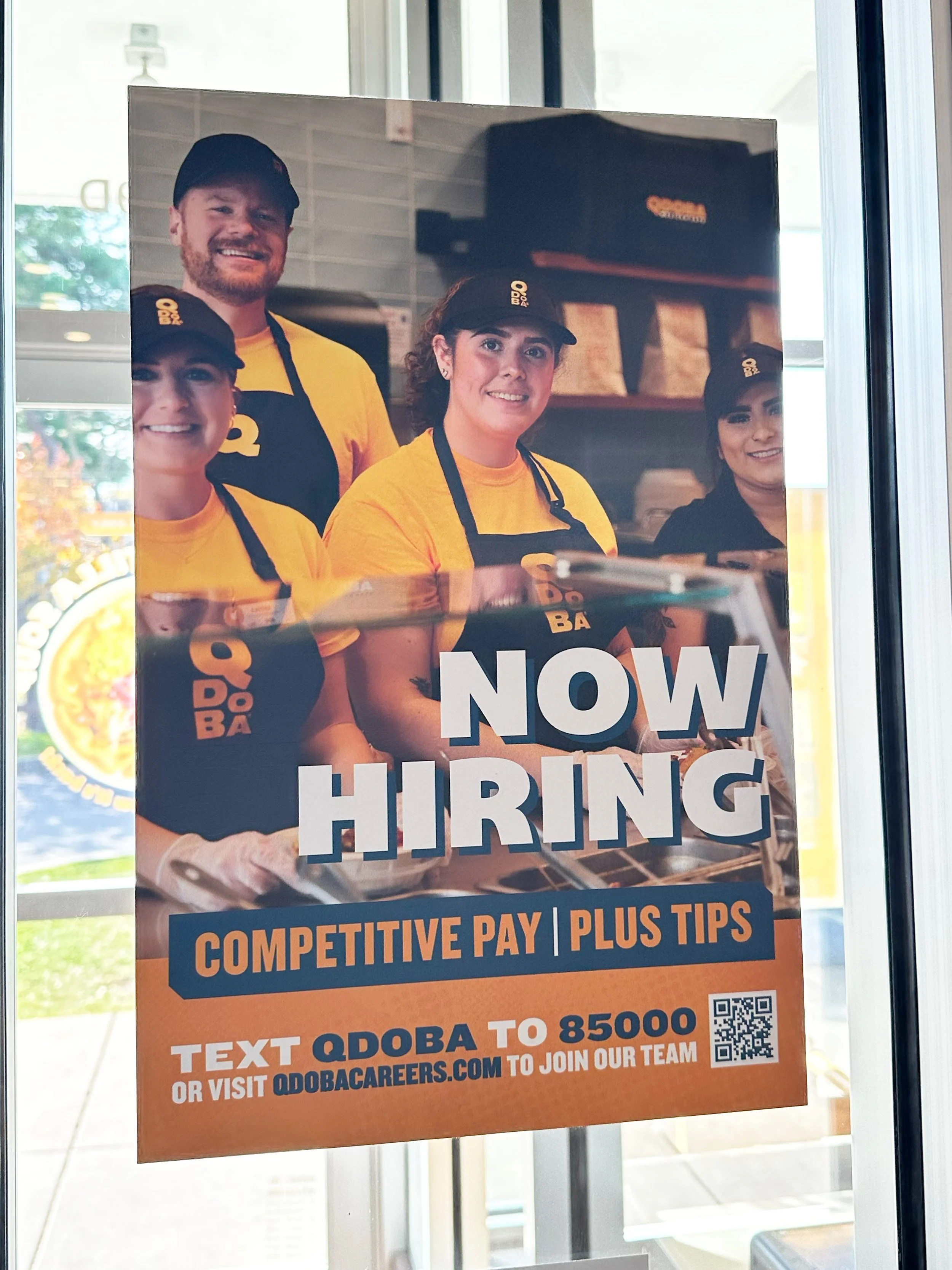
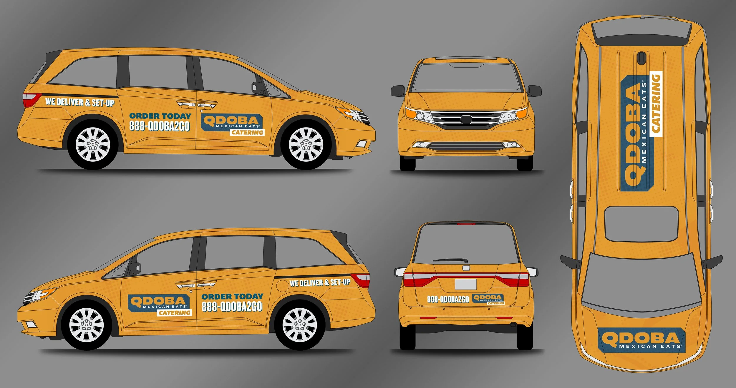
Updated external facing branding for QDOBA Mexican Eats, including new typefaces, main color palette, photography style, holding shapes, and textures.
The purpose of updating the brand look-feel was to focus more on flavorful food, flavorful people, and flavorful design. This new branding is seen executed through printed production, large-scale Out of Home materials, digital and social media assets, and in-restaurant materials.
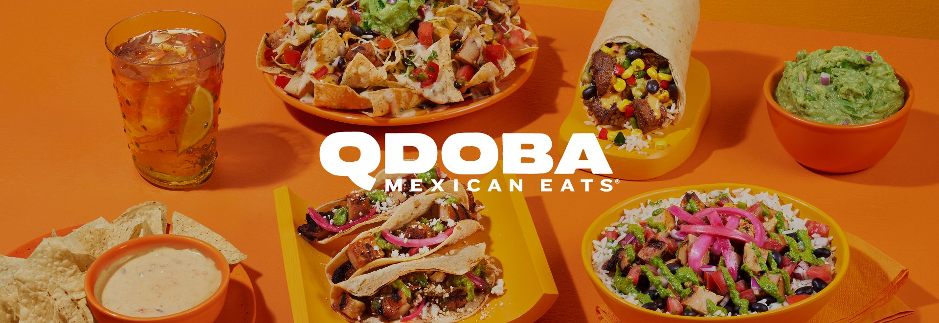
Color Palette
QDOBA Orange is paired with a Rich Blue color. The complementary colors elevate the brand when paired with bold typography and delicious food photography.
Typeface
Headlines and Subheadlines: Bemio and Knockout.
Body text: Knockout.
It’s All About Flavor.

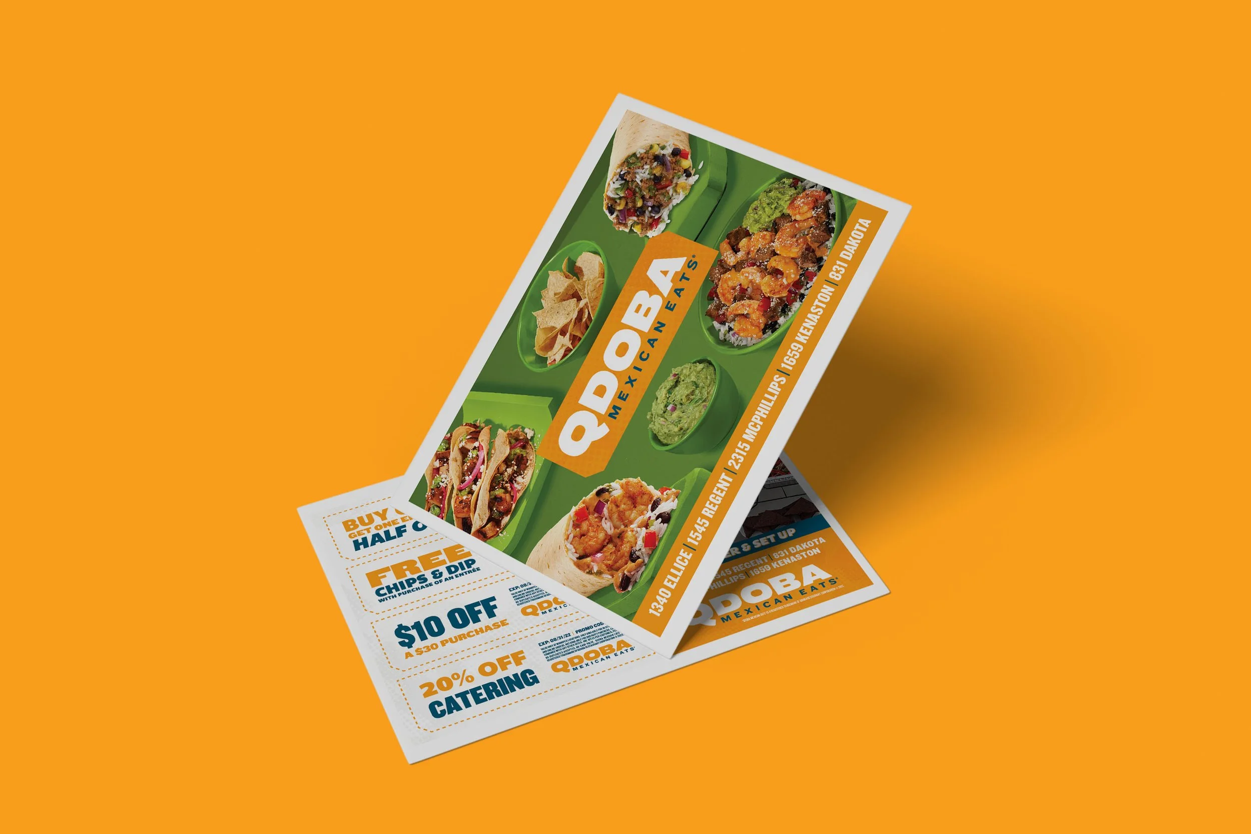


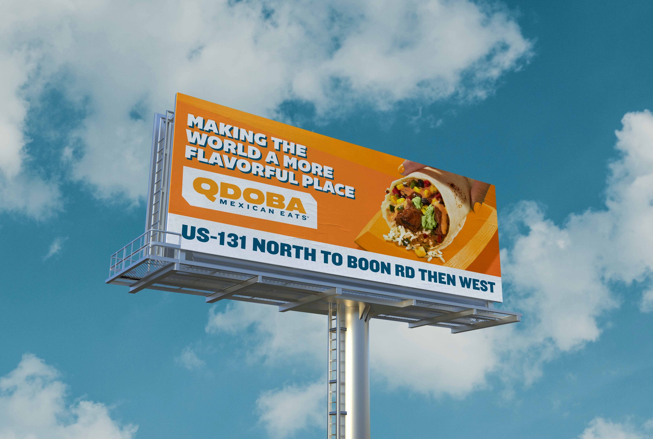
Print Materials and Out of Home
QDOBA creates freshly-made, Mexican-inspired food crafted with contemporary flavors that guests crave. This fresh food translates to the aesthetics and overall brand standards, which is why flavorful food is extremely important to the brand.


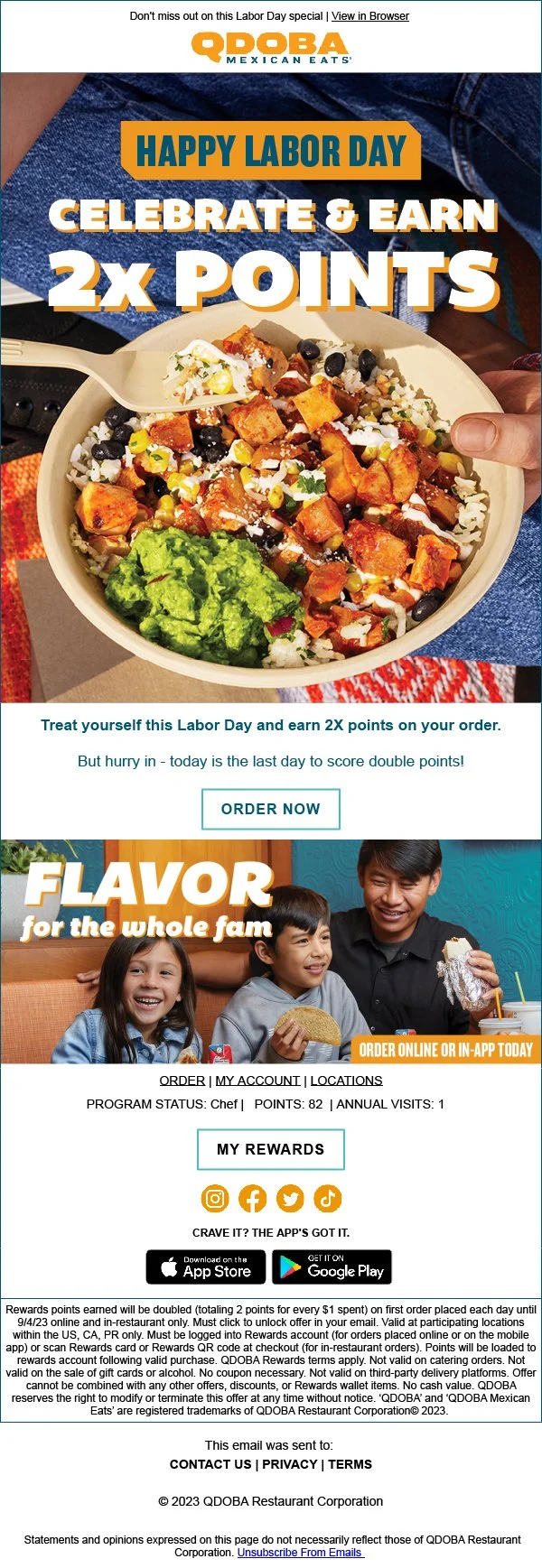
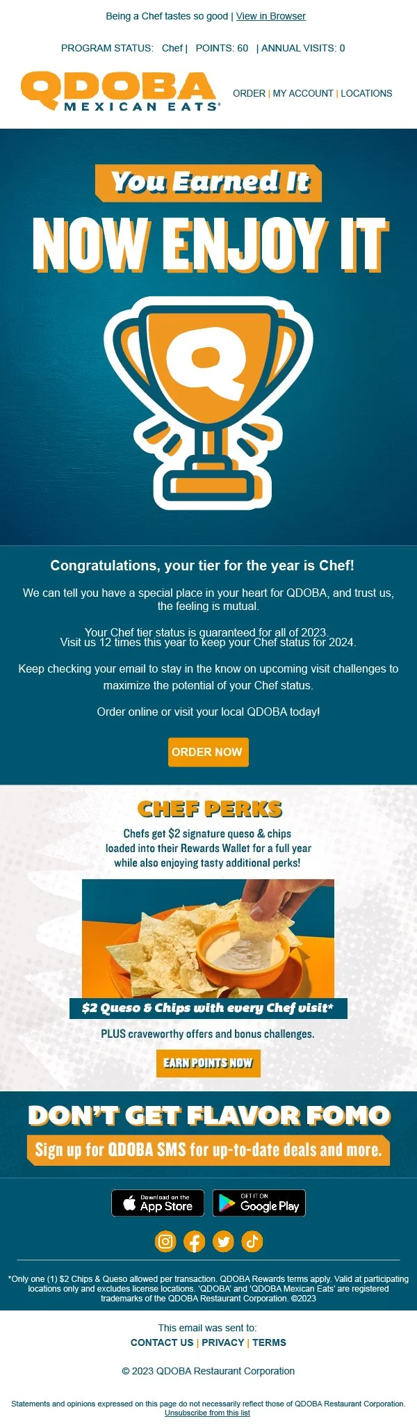
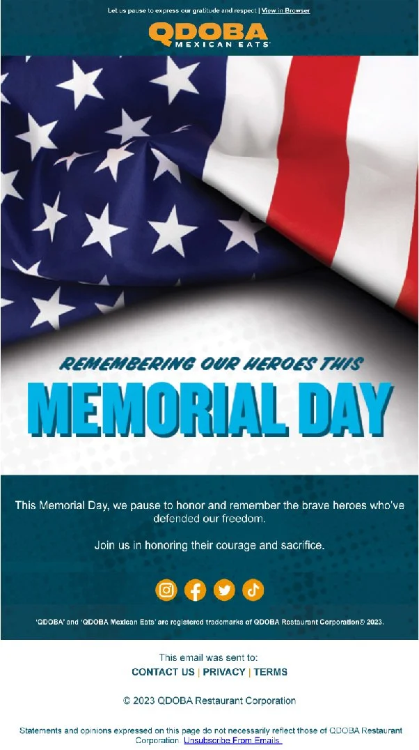
Email Creative
As QDOBA’s print creative was being sent out into the world, it was apparent that the continuous email creative was in need of a face lift following the 2020 rebrand.