
Main Street Kitchen
BRANDING + PRODUCT DESIGN
March 2021–May 2021
Complete Rebrand for a Local Sandwich and Pastry Shop.
What was done:
Name and concept
Brand strategy
Visual evolution
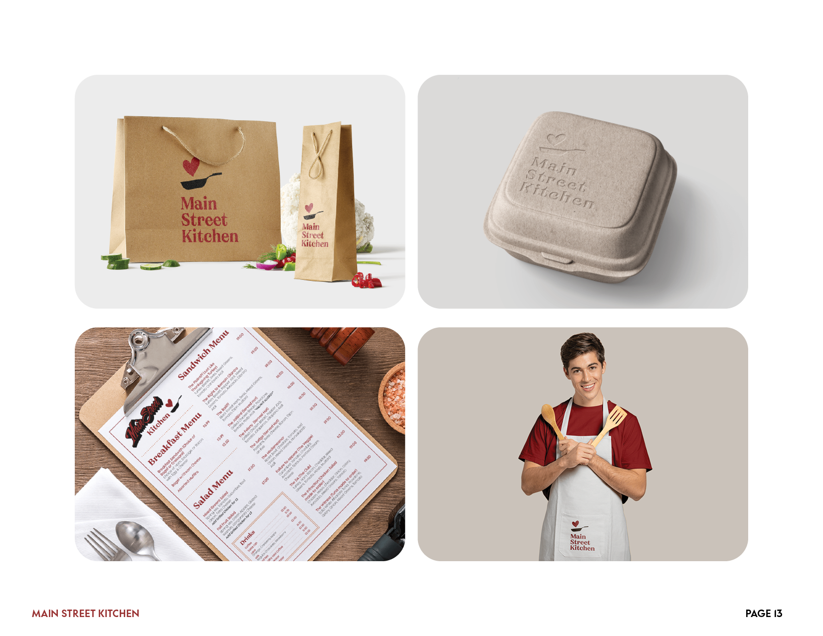
Packaging design
Digital strategy
Social media presence

Challenge + Solution
Main Street Kitchen wanted to reimagine themselves as not only a donut shop, but also a wonderful place to grab lunch with friends.
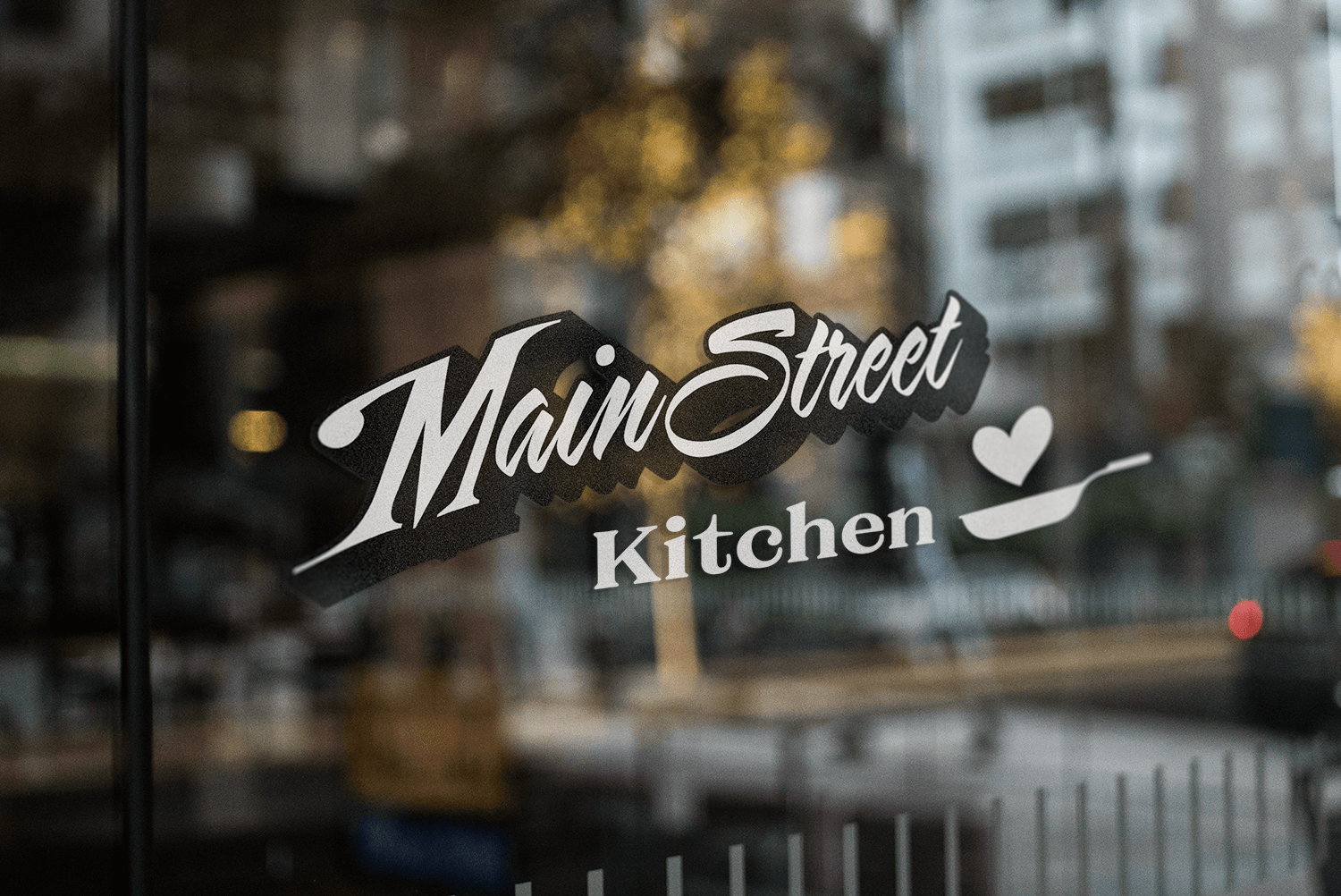
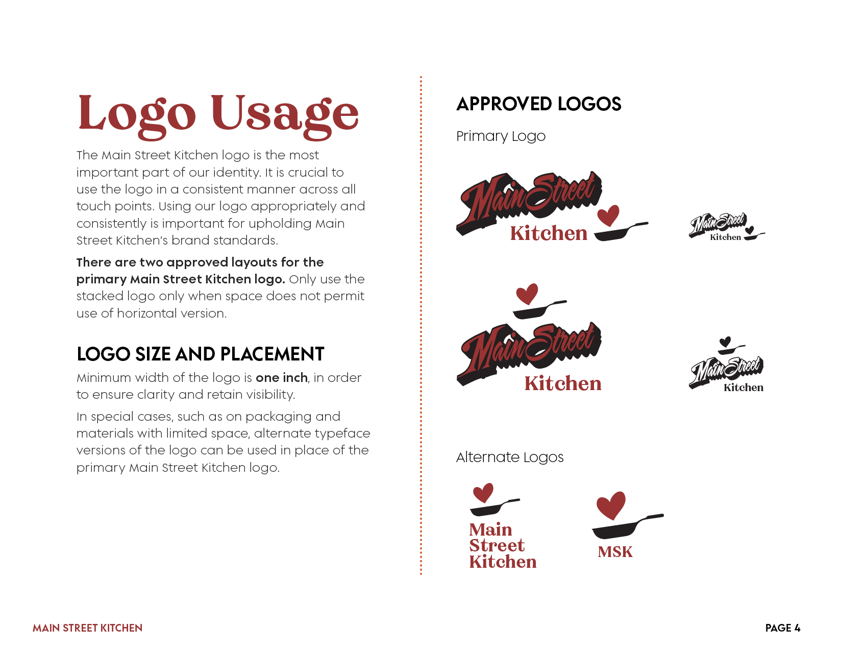
The main challenge with this rebrand was the logo: the owner wanted to keep the retro “Main Street” typestyle for the logo, while adding a modern and elegant look.
This project is a total rebrand, taking in to account the warm and friendly vibe that the owner wanted.
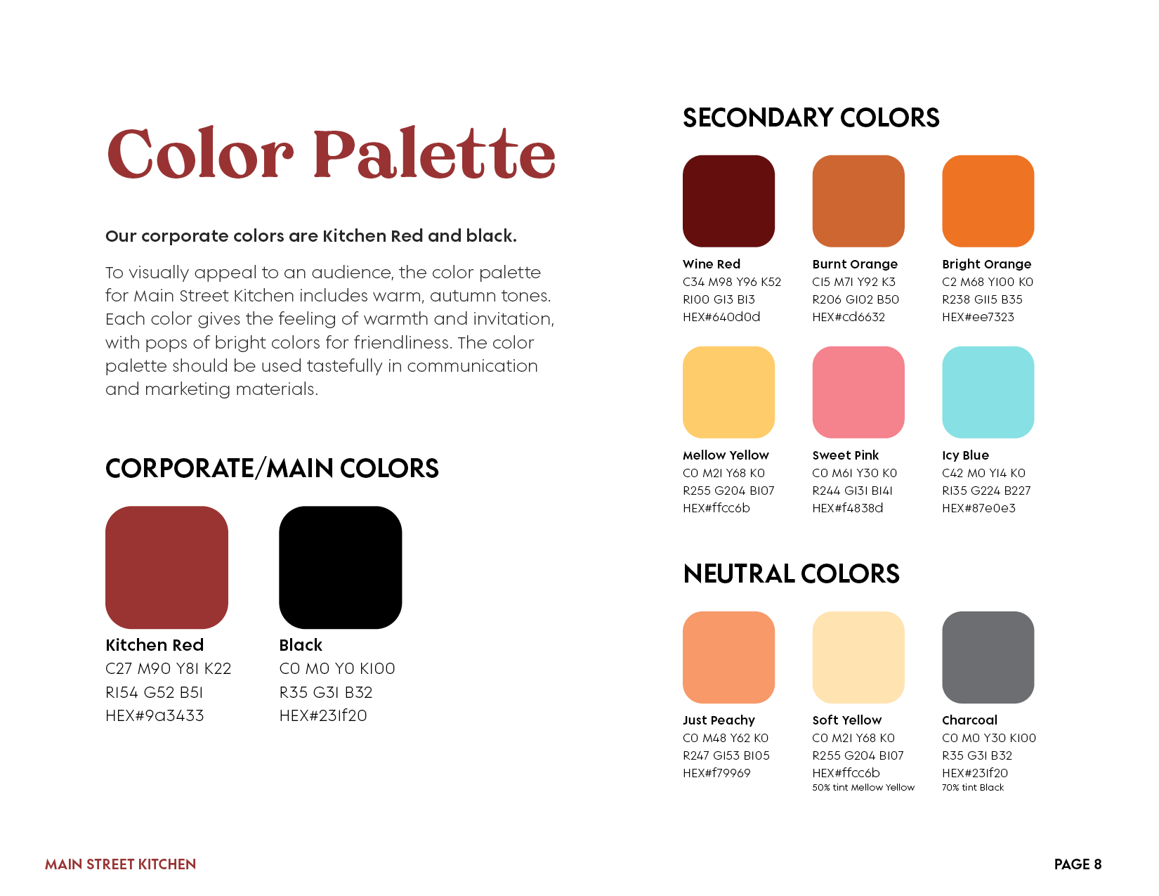
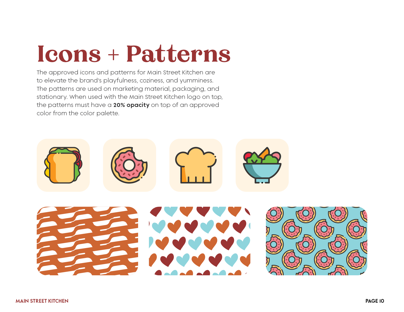
Color Palette
Warm autumn colors such as muted and dark red, burnt sienna, and pastel yellow were used to emphasize the welcoming feeling.
These colors were paired with a pop of light blue and light pink, which were used sparingly.
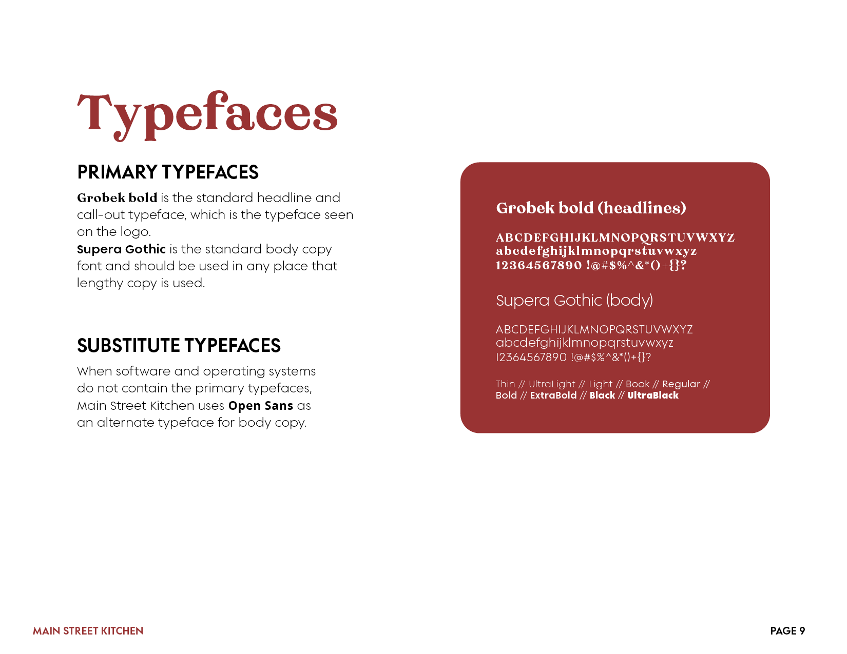
Typeface
Headlines: Grobek bold.
Body text: Supera Gothic.
Logo Usage
Main logo

Main logo (black and white)

Alternate versions

Alternate versions (black and white)


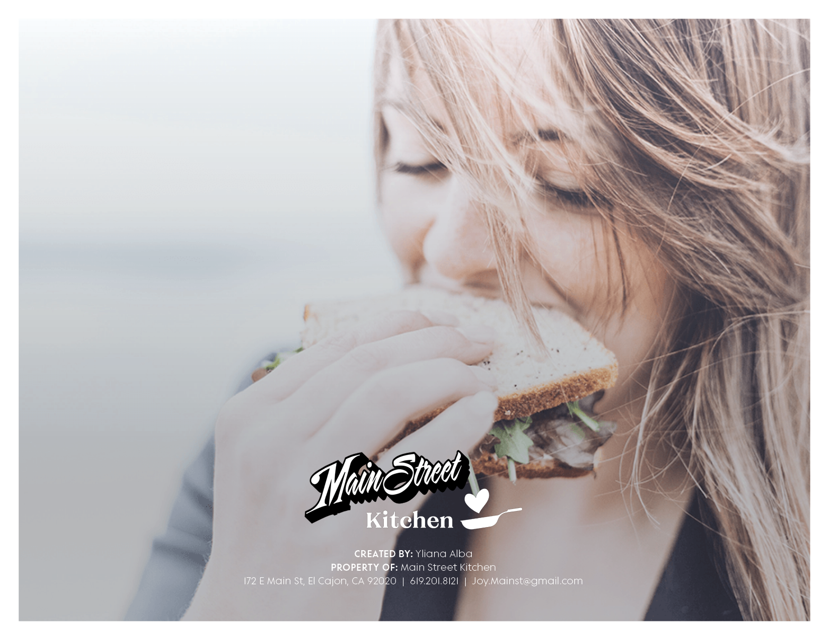
Love at First Bite.


A Reimagined Menu
An easy-to-read, clean, and unique menu was the main objective when rebranding Main Street Kitchen. Following a strict grid, minimal colors and patterns were used in order to make the design less busy, focusing on the stars of the show: the food!


All Are Welcome
Culture is important to Main Street Kitchen. The warm color palette and serif typeface are there to reflect the how everyone is at home when they’re here, while the bright colors and rounded sans serif typeface capture the essence of friendliness.


Art Direction and Designer: Yliana Alba